“Mostly peaceful” is not a dodge; it is a measurement problem. Crowds, time, and geography rarely line up neatly, so a single phrase can be simultaneously accurate by headcount and misleading by image—especially when broadcast next to fire and shattered glass.
The Short Version
- Participation was enormous—hundreds of thousands across France—while violence was carried out by smaller, often masked groups; both realities coexisted the same day.
- The BBC’s written coverage separated the main, largely orderly Paris march from later disorder, yet its “mostly peaceful” line aired over violent footage, creating a jarring frame clash.
- Arrests and injuries were high and spread across multiple cities, underscoring that the violence was geographically broad even if not numerically dominant.
- Images drive perception more than text; pairing calm descriptors with dramatic visuals predictably shifts audience takeaways toward “riot” frames.
What “mostly peaceful” measures—and what it doesn’t
When journalists call mass protests “mostly peaceful,” they usually index one of three denominators: people (the share of attendees who neither assault nor vandalize), time (the share of the day without clashes), or space (the share of locations without disorder). Those denominators are not interchangeable, and without declaring which one governs the claim, the phrase becomes elastic. In France’s nationwide demonstrations, the strongest quantifiable denominator was people: reporting placed total turnout in the hundreds of thousands while arrests numbered in the low thousands, suggesting a large numerical gap between participants and those implicated in violence. That establishes scale; it does not, by itself, capture how violence punctured the day in particular places.
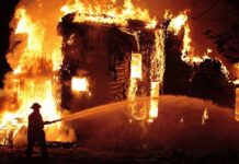
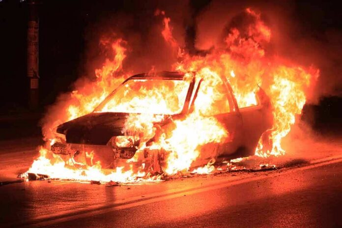
Visual salience complicates this further. Audiences weight burning vehicles and running fights far more heavily than long, uneventful marches, which are visually repetitive and underrepresented on air. The “mostly peaceful” descriptor, accurate by headcount, will sound minimizing when juxtaposed with flames. That is not audience error; it is how images work.
What the reporting actually showed
The BBC’s written accounts distinguished between the main march and later disorder: in Paris, the principal procession was described as largely peaceful during the afternoon, while separate pieces documented looting, fires, clashes with riot police, and injuries to security services. Another BBC write-up, drawing on later figures, cited roughly 1,800 arrests and cataloged burnt vehicles, smashed storefronts, and masked rioters across multiple cities. A BBC live feed and video segments detailed looting in Marseille, a fire at Lyon’s tourist office, arson at Limoges City Hall, and even a tourist train in Grenoble commandeered toward police—vivid proof that violence was not confined to one pocket. CNBC’s independent coverage mirrored the pattern: large, peaceful crowds alongside violent fringe groups who targeted property and police.
Mediaite’s critique targeted the television package’s construction rather than the underlying numbers: a correspondent’s “mostly peaceful” line aired over footage of a car being set ablaze, masked clashes, and a shop being stormed, producing an unmistakable dissonance between narration and pictures. In other words, the friction was editorial—the pairing of words and images—not a categorical denial of the day’s peaceful majority by attendance.
Why the frame clash matters
Television is a visual medium; when narration and imagery conflict, the image usually wins. Communication research consistently finds that pictures exert stronger framing effects on opinions and behavioral intentions than text alone; when images and text diverge, the composite tends to tilt toward what is shown, not said. In protest coverage, that bias amplifies the “riot” and “confrontation” frames—conflict with police, spectacular damage, kinetic movement—over the duller reality of hours of marching without incident. The result is a predictable perception gap: an anchor can be numerically correct about “mostly,” yet viewers reasonably come away with “it looked like a riot.”
This is why precision in denominators and sequencing matters. If “mostly” refers to the main Paris march by time of day and headcount, say so; if the package then moves to evening violence elsewhere, say that too—and show it in order. Clear time-stamping, city labeling, and on-screen chyrons that separate “Paris, 14:00—march” from “Lyon, 20:30—fire set at tourist office” reduce cognitive whiplash and the impression of euphemism.
Genuine points of contention—and what stronger evidence would resolve
Two weaknesses run through the record. First, “mostly” is unmoored from a declared denominator. Attendance estimates and arrest counts offer a people-based numerator/denominator, but arrests are an imperfect proxy for violence, and turnout was national while incidents were local. Without a method—by headcount, hours, blocks—the phrase remains imprecise. Second, arrest totals varied across BBC pieces—more than 1,200 in one report, approximately 1,800 in another—likely a function of rolling updates, but unexplained inconsistencies feed skepticism in a charged information environment.
What would settle the debate about framing quality is not a metaphysical argument about tone but a reporting audit: the program log and transcript (to map narration-to-visual alignment), synchronized with police prefecture tallies and municipal incident logs by city and hour. With those, one can state defensibly, for example, that 85% of attendees in Paris departed without incident by 18:00, while specified incidents in Marseille, Rennes, Toulouse, Angers, Lyon, Grenoble, and Limoges occurred between stated times, producing X injuries and Y arsons. That is how “mostly” becomes a number rather than a vibe.
On Saturday, October 17, 2026, France experienced its most severe nationwide violent protests since the "Yellow Vests" movement of 2018. The Ministry of the Interior reported approximately 550,000 participants, while labor unions estimated the figure at 800,000. At least 1,200… pic.twitter.com/cI1RzN3LtM
— THE WORLD CORRESPONDENT (@TheWorldCorresp) October 18, 2026
How to watch protest coverage like a pro
Three habits serve viewers well. First, identify the denominator on offer. If a report says “mostly peaceful,” ask: mostly by headcount, by hours, or by places covered? Second, watch for sequencing and labeling: do the words and the pictures refer to the same time and city, or is the package cross-cutting locations without explicit cues? Third, separate significance from share. A small group can produce outsized harm—burning a historic city hall is consequential even if only a handful did it—while a massive, orderly march is politically meaningful even if it yields few dramatic images. Both can be true at once.
In the French case, the most supportable summary is straightforward. Hundreds of thousands marched; many did so peacefully. Violent factions, some masked and mobile, carried out arsons, looting, and assaults across several cities; police and emergency personnel were injured; arrests were in the thousands. The BBC’s written work captured both realities with city-by-city detail; its on-air phrasing over vivid riot footage created a frame clash that predictably read as minimization to critics. The lesson for newsrooms is not to retreat from scale or from hard images, but to declare denominators, synchronize narration and pictures, and report the day on all three axes—people, time, and place—with the same rigor.
Sources:
mediaite.com, bbc.com, bbc.co.uk
© fixthisnation.com 2026. All rights reserved.